History of Color
Perhaps all the great mysteries are written in the heavens. Color theory, hypothesized back in the 1660s by English physicist Sir Isaac Newton, was discovered through a sequence of experiments using glass prisms. Newton found transparent crystals would “refract or bend” white light creating separate colorful hues. The stroke of the divine’s paintbrush across the sky after a light mist of rain on an otherwise sunny day is an awe evoking manifestation of this natural phenomenon. This majestic show of color, the rainbow, is scientifically called the visible spectrum.
It was later determined that light travels in waves, carries a visual temperature, and each wavelength can be further divided into cool and warm tones. Newton then organized the colors according to how they appear in the visible spectrum.
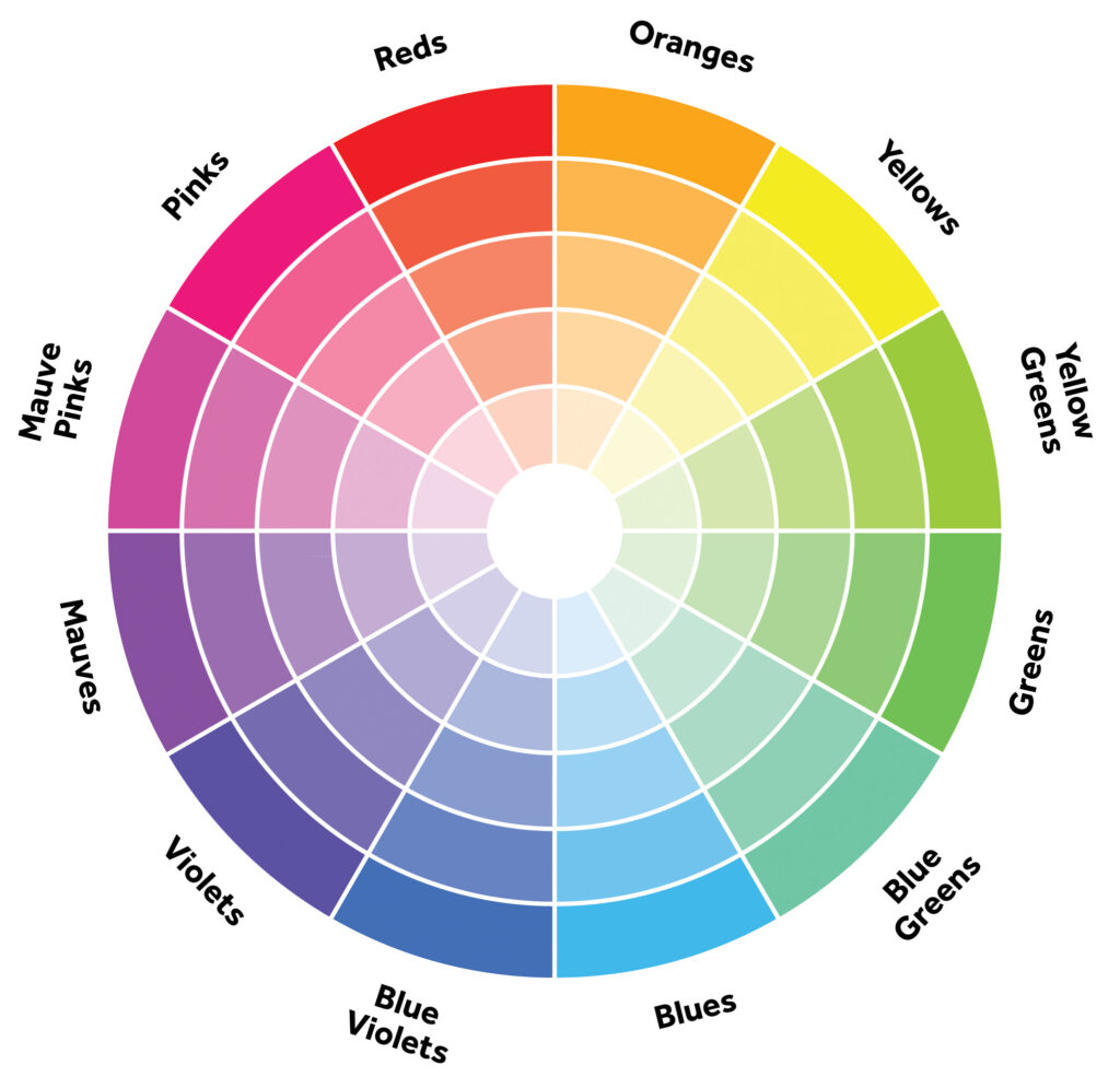
Most of us probably remember memorizing this back in grade school. Can you recall Roy G, Biv… Red, Orange, Yellow, Green, Blue, Indigo & violet? These colors were developed into the first color wheel now used by artists, designers, and marketing moguls alike.
The color wheel not only arranges the color rainbow but demonstrates their relatability to each other. Colors are coupled and matched together to evoke particular moods, achieve a desired effect, and make a statement.
Let’s take a closer look at the most complaining pairings in what i’m playfully calling chromatic connections…
Complementary
Fun and bold but not for the faint at heart. These two stand out in a crowd, and is one instance where opposites attract. They are from opposing sides of the color wheel, but this high contrasting coupling makes quite the dynamic duo. Certainly striking visually with an energetic vibe. Examples include LSU purple/gold, orange/blue and the festive christmas color combo red/green.
Analogous
These two are always side by side. Their qualities blend easily into one another, while maintaining a colorful yet more relaxed relationship. They mingle splendidly with close neighbors, but remember to keep gatherings at a limit of 6 please. Try a palette of hues of blue/green with pops of yellow.
Monochromatic
And sometimes a party of one suites us best. Choose a single color and commit to it. Diversify by showing various shades of the same intrinsic hue. Light and dark variations create depth and character. Add intrigue and personality with patterns and textures. Beige or gray are often used in a monochromatic neutral color scheme. Often soothing and gives off a more relaxed ambience. Choose the color and blend with another color 2 shades lighter and another 2 shades darker on the same paint strip. Contact us for kitchen remodeling in league city.

