Go to the distance
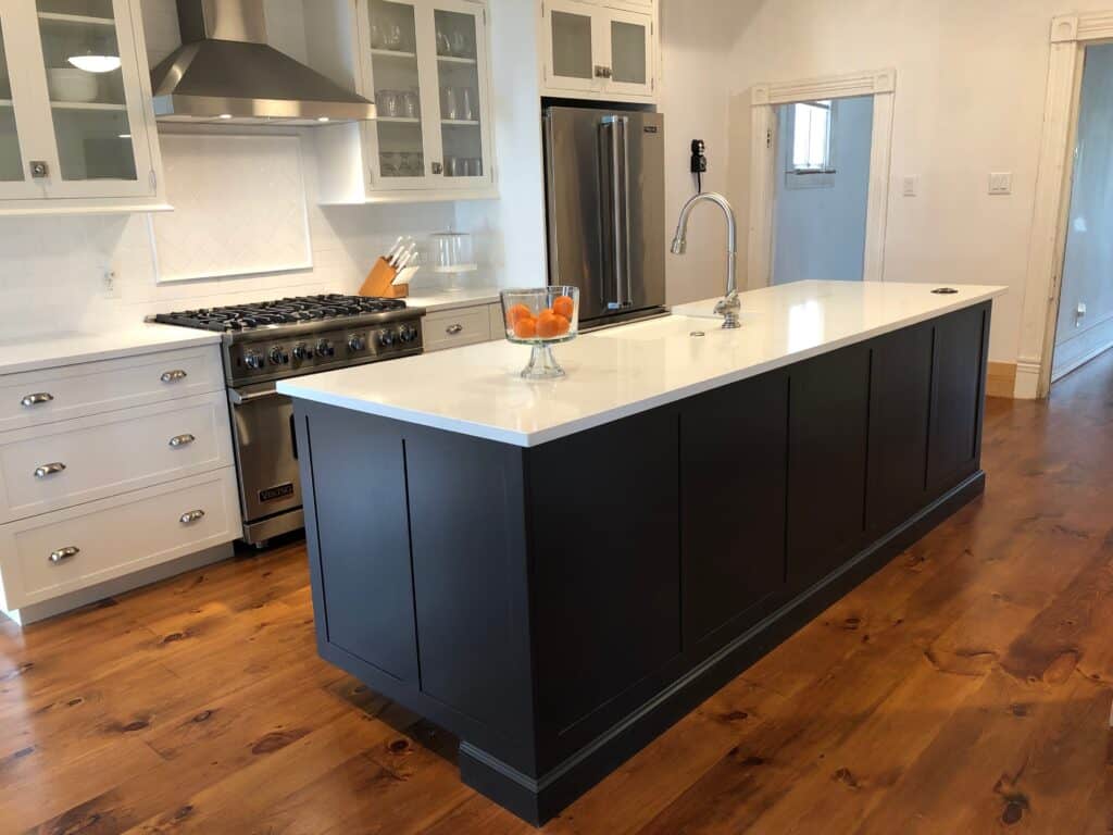
- extend wall tile up to the ceiling for full impact. I love this look behind a range in a kitchen or around a shower/tub combination in a bathroom. It creates a completed look and adds visual height.
Base drawers instead of cabinets
- opt for base drawers instead of lower cabinets for maximum storage. Diagonal drawer dividers sort pans and lids assuring everything is easy to find. A wooden pegboard insert holds stack dishes in place. Add a spice organizer, utensil and knife block just to name a few other suggestions.
White walls
- White is classic, timeless and serene. It gives a room a clean appearance and makes everything else pop. Add in elements of natural wood grains, honed stone and mixed metals in simple clean lines to increase visual and textural interest.
Reimagine you cabinetry layout
- Mix in open shelving and vary upper Cabinetry Heights to break up a extended shelf of cabinets along a main wall. Create the illusion of a brighter more open space by eliminating upper Cabinets on either side of the window.
Get rid of stuff
- I cannot stress this one enough. Create less drama in your life by letting go of the things that no longer serve you. Lighten the load and find yourself breathing easier and no time. Think “essential beauty” instead of “unnecessary ornamentation”. Ponder what is truly important to you, what has real value, and get rid of the rest. A lesson maybe not only in design, but in life.
My favorite design tips for the fall part 2
Lighting
- Lighting is jewelry for your home. Lighting is a fun way to add a little whimsical in an otherwise ordinary setting. Remember to layer lighting as well. Task lighting, ambience lighting, etc. and dimmers are a must!
Let nature In
- bring in a bit of nature. Nothing makes a space more inviting than fresh flowers and greenery. Living elements add energy and warmth. Setting a plan next to the window is a must. The vertical growth adds height and fills the empty corner. Plus, they look amazing in both traditional and modern settings. Fresh flowers make a room pretty and adds a soft feminine feel.
Books, Books, Books…
- I love a great collection of books over the years, i’ve become an avid reader. Build a well-rounded collection of classics, biographies of interesting people, favorite hobbies, travel and whatever else suits you. Guest will always be drawn to your bookshelves. Throw in pieces of beloved art work and personal mentos to show off your unique personality. My favorite way to organize my books is by color block, grouping them according to color. Play with arrangement and have fun with it.
Juxtapose virile and Feminine Design Elements
- combine and arousing Juxta position of virile and feminine qualities in your space. For example, imagine forceful, linear architectural lines blended with luxe soft textiles and furniture with curvature. Another example would be to make stripes and plates with floral motifs and soft goods and upholstery.
Play with different time periods
- The genius of a well designed room has classic and timeless pieces mixed with the contemporary and abstract. Enough said.

